

QB Sync Made Easy is a brand asset of HIC Global Solutions. It is an integration app that connects QB Sync storefronts with Salesforce CRM.
As the brand QB Sync Made Easy uses the QB Sync name in the logo, some guidelines are laid to comply with QB Sync brand usage and to correctly use QB Sync Made Easy’s logo for design and co-branding purposes.
Please be understood that by using our brand assets, you indicate your acceptance of our Trademark Usage Guidelines, and any violation of these guidelines will result in the termination of your permission to use our brand assets.
The guidelines in it will help us maintain graphic and message continuity, protect our logo assets, and build powerful, relevant messaging across a variety of platforms when used appropriately.
Proprietary logos, approved typefaces, the visuals we choose, and the words we use — every part of our brand is an important part of our whole brand. That’s why it’s extremely important that we use each very carefully.
Following the guidelines and rules in this style guide will help us speak with a single, influential voice to generate bold, engaging communications, build strong bonds with our audiences, and protect our brand for years to come.
QB Sync Made Easy, with its purpose of making data-syncing seamless between the eCommerce platform and the CRM, has a clear Brand Voice that is
We convey genuine information by keeping our Brand Tone
while maintaining integrity, equality and avoiding any exaggeration or misinterpretation.
The QB Sync Made Easy logo comprises our brand name and the tagline set in Montserrat. We prefer using our primary logo in most instances.
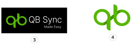
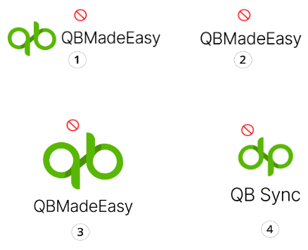
Please follow the instructions in the guide for the correct usage of our logo.
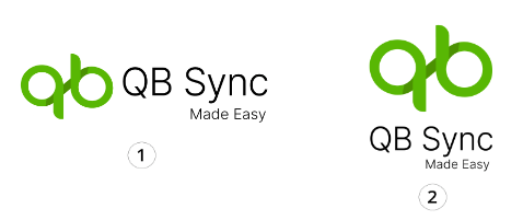
Partnering with a third party may require us to use a co-branded logo. The logo is composed of three elements: our primary brand logo, a dividing line or “| or +”, and a third-party logo. It is important that the logos are equal in size.
Please note that we allow third parties to use our logo only after specific permissions.

+


+


Everyone likes a little personal space. Our logo does too. Make sure it can breathe by reserving clear space equal to the height of the “S” on all sides.

Don’t make people squint. In digital applications, our logo should be at least 110 pixels wide. In print, it should be at least 1.2 inches (3 centimeters) wide.

HEX: #58b705
RGB: R 88 G 183 B 5
HSL: H 92 S 97 L 67
CMYK: C 52% M 0% Y 97% K 28%
HEX:#000
RGB: R0 G0 B0
HSL: H 146 S 45 L 72
CMYK: C 75% M 68% Y 67% K 90%
ABCDEFGHIJKLMNOPQRSTUVWXYZ abcdefghijklmnopqrstuvwxyz (.,:;?!@#$%^&*) 0123456789
ABCDEFGHIJKLMNOPQRSTUVWXYZ abcdefghijklmnopqrstuvwxyz (.,:;?!@#$%^&*) 0123456789
HEX: #58b705
RGB: R 88 G 183 B 5
HSL: H 92 S 97 L 67
CMYK: C 52% M 0% Y 97% K 28%
HEX: #283251
HEX: #572cd3
HEX: #572cd3
RGB: R 87 G 44 B 211
HSL: H 255 S 66 L 50
CMYK: C 59% M 79% Y 0% K 17%
HEX: #283251
RGB: R 40 G 50 B 81
HSL: H 225 S 34 L 68
CMYK: C 51% M 38% Y 0% K 68%